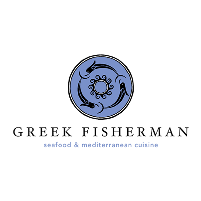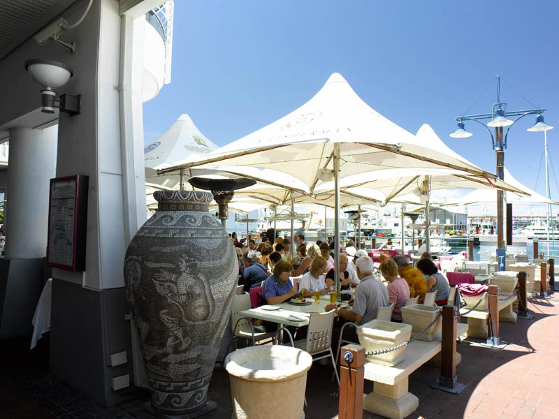
Greek Fisherman Logo
When asked if we’d create a logo for Cape Town V&A ‘s popular eatery we jumped at the chance.
The only prerequisites were that the logo needed to be clean, simple and suit the curent revamp – and should at all costs include magenta as a main colour (the accent used throughout the revamp).
Worked with the owner and referencing the venues elements we created a set of initail concepts. Of these one which used hand crafted dolphins surrounding waves in a roundle was selected.
The one aspect which seemed a little at odds was the use of magenta. Its brightness overpowered and detract from the design. After discussion with the owner we decided that using a complementary colour would tone down and balance the use of the venues accent quite well.
The hand craftedness of the icon and lettering gave the logo a carefree feeling which suited the relaxed attitude of the venue.